My Scrivener Layout
For those of you who are writers and use Scrivener, this is the layout I've customized:
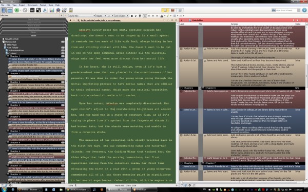
I originally tried to design a theme that's solely for the purpose of non-fatiguing viewing of prolonged periods, but that doesn't work well for clear identification of different storylines or character POV's, so I had to create enough contrast between the different storylines to be clearly different from each other, but still pleasant to look at. The main text-editing area have colors I have been using for a while now--it's the most non-fatiguing text/background combination that works for me. it's not too contrasty (like white text on black background, or vice versa, which is way too glaringly bright and gives me a headache).
The .scrlayout file can be downloaded here (right-click link and "save link as." This is for PC version of Scrivener only. If you're on the Mac, you can replicate my layout by using the color numbers I've listed below).
Since Scrivener's layout file (.scrlayout) isn't compatible between PC and Mac, for those of you who are on the Mac, here are the actual colors I'm using:
(Listed as numbers for the Red, Green, and Blue in the color picker, and I only listed the areas I customized)
General
-Binder Background = All are 85
-Outliner Background = All are 138
-Document Notes Background = all are 126
-Alternate Background = All are 153
-Recent Search Background = All are 62
Editor
-Text = 254, 255, 164
-Page = 64, 93, 57
-Text Selection Background = 255, 128, 0
-Text Selection Text = white
Full Screen
-Background = black, Alpha channel = 255
-Text and Page same as Editor
Index Cards
-Index Card Divider = 70, 104, 255
-Index Card Lines = all are 140
-Index Card Status Stamp = 180, 85, 83
-Index Card Border Color = all are 77
-Index Card Background Color = 179, 159, 121
Fonts - I prefer Verdana for anything that's not the actual manuscript, since it's much easier on the eyes for me.
Label colors
-Black
-all are 39
-all are 121
-52, 63, 80
-139, 127, 111
-85, 57, 57
All Collections colors are same as Binder, since the way the GUI works right now in the PC version isn't intuitive to me, so I prefer to just look at the name of the collection in the selected view instead of identifying the Collections tabs by color.
I always have split view turned on, and the right pane is locked as Outline view, showing all the files/folders fully expanded. The middle pane is always the actual manuscript. I never use the Corkboard view since it's useless for me (I use Writer's Cafe's Storylines feature for plotting, which is much more useful for my needs).
I have the backup button placed on the main toolbar, so I can easily backup. I also have text statistics, project targets, and snapshots on the main toolbar.